Monday, 28 March 2016
Evaluation Activity Task 5 - Youtube Annotation
How did you attract/address your audience?
We have annotated our opening sequence below identifying what we did to engage and attract the right audience to our genre:
Sunday, 27 March 2016
Evaluation Activity Task 4
What would the audience be for your media product?
Target audience:
Our film certificate is a 15, therefore this allows us to reach a wider range of teenagers instead of just strictly Adults due to there may be being the occasional swearing and moderate sexual references.
Our target Audience is Teenagers and young adults who enjoy the Adrenalin rush processed from these horror genres...
A teenage boy interested in the horror genre, would typically listen to possibly indie-alternative music, or even rock, as horror is a very forward genre, not like a romance or comedy.

Evaluation Activity Task 7
Looking back at your preliminary Task (the continuity editing task), what do you feel you have learnt in the progression of it to full product?
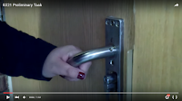
This is our first significant shot in our preliminary task. We chose to start of with a close up shot done by hand filming a mysterious character opening a door handle. we used the school camera to film this shot so the sound was not best quality. There is also non diegetic background music playing which is quiet and eerie this creates suspense.
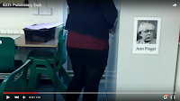
We continued to film our main character from the back so it would create a sense of mystery and leave our audience wondering who this person is and what they are hiding. The idea of creating mystery was then later developed in creating and editing INHABITANT as our supernatural being is rarely revealed in the opening scene , the dark attic that the supernatural being lingers in connotes danger and mystery. We also used an effect called ''bad tv transition" which enabled us to create distortion in a significant shot in the attic when the camera pans to the right and the audience catch a quick glimpse of the ghostly figure the distortion effect quickly comes in interrupting the footage and making it unclear of what the audience can see therefore emphasising on the mystery of this supernatural being as we rarely get to see its front. We also improved our sound quality for INHABITANT as in addition to using our camera microphone we also used a music recording microphone which enabled a sharper quality sound. However this was only shown through the beginning scenes in INHABITANT. This was achieved by dubbing over the original sound . We also progressed our filming technique by using a tripod to achieve still shots where as in our preliminary task the filming was quite shaky. We also used jump cuts effectively in INHABITANT as it made the cross cutting of scenes smoother and quicker also creating pace to our opening scene. Where as in our preliminary task we did not film enough frames for there to be slick cross cutting we also had very little knowledge of editing and creating jump cuts effectively. The first title shot in the beginning of our preliminary task is very plane and only lasts one second. We improved our use of titles in our film opening as we had more knowledge of editing the font so we used the clockwork effect on Adobe premier to create a a clockwise appearing font that is revealed slowly connoting mystery and lasting longer then the titles used in our first task.
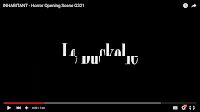
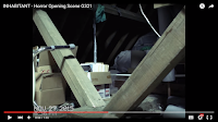


We continued to film our main character from the back so it would create a sense of mystery and leave our audience wondering who this person is and what they are hiding. The idea of creating mystery was then later developed in creating and editing INHABITANT as our supernatural being is rarely revealed in the opening scene , the dark attic that the supernatural being lingers in connotes danger and mystery. We also used an effect called ''bad tv transition" which enabled us to create distortion in a significant shot in the attic when the camera pans to the right and the audience catch a quick glimpse of the ghostly figure the distortion effect quickly comes in interrupting the footage and making it unclear of what the audience can see therefore emphasising on the mystery of this supernatural being as we rarely get to see its front. We also improved our sound quality for INHABITANT as in addition to using our camera microphone we also used a music recording microphone which enabled a sharper quality sound. However this was only shown through the beginning scenes in INHABITANT. This was achieved by dubbing over the original sound . We also progressed our filming technique by using a tripod to achieve still shots where as in our preliminary task the filming was quite shaky. We also used jump cuts effectively in INHABITANT as it made the cross cutting of scenes smoother and quicker also creating pace to our opening scene. Where as in our preliminary task we did not film enough frames for there to be slick cross cutting we also had very little knowledge of editing and creating jump cuts effectively. The first title shot in the beginning of our preliminary task is very plane and only lasts one second. We improved our use of titles in our film opening as we had more knowledge of editing the font so we used the clockwork effect on Adobe premier to create a a clockwise appearing font that is revealed slowly connoting mystery and lasting longer then the titles used in our first task.


Evaluation Activity Task 2
How is your media product represent particular social groups?
How is our Film opening used to represent social groups.

Another example of a cliché representation of teenagers is seen in "It follows" which is one of the films which influenced us in making "INHABITANT" the teenagers in "it follows" are represented as reckless and dumb as the main character has sex with multiple people and they make stupid decisions like towards the end when they plan to take lots of electronic devices to a swimming pool and plug them in so that they can chuck it in the swimming pool when the antagonist jumps in the pool to attack the victim who is the main character. How ever there plan was very dangerous and risky and it ends up back firing and almost causing the main character to die. The girls in "it follows are also veru sexualised with their costumes being revealing as the main character is always wearing a swimming costume or she is seen in her famous sexy pink lingerie.
However in INHABITANT our two main characters who are two young adult girls. They are represented in ways which challenge but also conform to the general stereotype of Teenagers in horror movies.
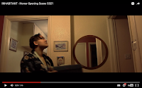
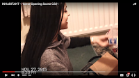 "Lisa" is portrayed as fairly sensible due to her modest clothing and unpacking all the boxes whilst shown to encourage her partner Ellie to do so also. Lisa's clothing is very modest and casual, this subverts from the stereotype of girls being over sexualised in horror movies as her behaviour is seen as acceptable as her character is sensible and not the stereotypical "dumb", she is therefore challenging the usual representation of women.
However, Ellie is portrayed as quite silly and immature as she films and mocks her girlfriend "Lisa" whilst also shown to be flirting slightly. This conforms to the stereotype of teenagers being irresponsible and acting as sex symbols. Ellie's character also seems to lack common sense as she lingers in the attic despite the lights somehow turning off. The common sense would be to exit the attic, however she is shown to shout for Lisa, supposing it was her, and using her phone to guide the way. She is then attacked in the attic and as the audience we hear her falling dropping the camera and also screaming, this demonstrates Ellie as a vulnerable character. We chose to do this as it is conventional for horror films as girls are usually portrayed as vulnerable as there are many significant shots of girls running away and falling down with high angle shots so that the girls look vulnerable. Ellie conforms to the general stereotype of girls being victimized in horror films, we had the character Ellie pan the camera upwards in a low angle shot to reveal the supernatural being so that the ghostly figure looks overpowering and intimidating also creating the representation of vulnerable and weak for Ellie.
Evaluation Activity Task 6
What have you learnt about technologies from the process of constructing this product?
Paint.Net was used to mess around with several ideas for our font for "INHABITANT" by picking several types of fonts that conform to the horror genre. This was a simple step as it was pretty self explanatory technology, as we had knowledge and experience of this software.
The next technology used in our production was the CANON 700D, which was most probably the most important piece of our film, as this was the camera used to film the opening sequence. Although we had little experience in this camera, we quickly adjusted to its capabilities in order to achieve the best outlook we could possibly have with our little knowledge. This camera had a lens which enabled us to zoom and focus precisely, which was shown especially in the beginning in the packing scene. This shows our skills in camera work and movement, as we used a variation of stills and handheld. The use of these two techniques enabled an engagement with the audience as we are shown two sides to the story, one being the characters, as they "vlog" themselves, and also a "behind the scenes/film" outlook through the stills. This camera was also used when filming the Actor interviews, as we wanted a professional clean and slick finish, which would make the whole production look real, as opposed to a quickly edited and filmed video on an iPhone, however this would still be able to achieve a realistic shot, we decided to go all for it. However in this interview, we used an additional microphone which gave a crisp quality sound, which made the audience feel as if it was a real interview. Black out cuts were used to add in questions that were asked throughout the interview, this was achieved by Adobe Premier Pro CC 2015.
Secondly, we are introduced to the editing software "Adobe Premier Pro CC 2015" of which we had access to at my house on my laptop. I bought this software in order for us to professionally edit together our film, however also at home, other than just at school using their computers. This is shown off through our high use of editing and effects, which would allow the audience to see its progress on a professional software such as Adobe. We feel as we achieved this in our final production, as we can see this through different editing techniques that aren't achievable in such software such as "Windows Movie Maker". Editing, for me was on the easy side, as i have had several past experiences in editing, whether it be for my personal choices, or school purposes. I also learnt some knowledge in editing through my brother, as he was a past Media Student. I took this information, and taught Luiza, which helped us work together and edit the film, using the knowledge we both had, with also the additional YouTube tutorials when it came to special effects.
Throughout this year, we developed our skills in Blogger, where we would weekly post blogs on our research, panning, and production...At the stat of this year, we had little knowledge, You will be able to see throughout our blogs, our knowledge in using these software has developed, which shows our learning and skill development throughout this course.
Monday, 21 March 2016
Evaluation Activity Task 1
INHABITANT Analysis
In what way does your media product use, develop or challenge forms and conventions of real media products? (i.e. of film openings)
Inhabitant, a film produced and directed by myself and Luiza Paulielo, develops and challenges forms and conventions of real media products. This is introduced through several ways. Firstly, our film title conforms to the horror genre as "inhabitant" literally suggests a creature of somewhat occupying somewhere or something.
The opening to our film begins straight up with "found footage" this insinuated the plot of the story immediately as we associate found footage to lead to something out of the ordinary, this suggest that the film may be of the Horror or Thriller genre. It flows nicely with jump cuts, this infers that the footage is old.
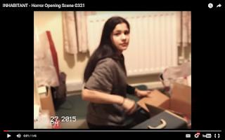
This is the first significant shot to our opening sequence. This shot is shown effective due to it establishing the location, which is proven to be a home. Here we are shown the character of a young girl, this shows prevalence to the character which means that we will empathize and relate to this specific character. This shot is edited through adobe premier pro where we have cut the format of the video to express more of a found old footage effect. The use of VCR digital font conforms to the stereotypical found footage format. This is effective because it is more realistic and the audience can relate to this. We chose to begin with establishing the concept of "packing" in a home environment, which allows the audience to have a brief idea of what is going on. By colouring the video, we added a slight touch of a video camcorder, by lessening the vibrancy, and adding grain, by altering the RGB we were able to find the perfect tone to portray this effect. It is important to do this so that we enable the audience to immediately realise that this is video footage, despite the use of text in the corner.
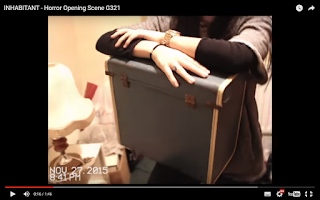
Following the first shot, this is the second most important shot to our film. Here we are shown an extreme closeup of a box, to the audience, this wouldn't be a significant part of the film, however we then learn this is the reason and object into leading into the next scene. The "camcorder" lingers on the object by zooming in and out of the object, this identifies its significance, and brings the audience to focus on the box other than the dialogue. This is done to develop mystery and suspicion towards the prop. The close up also suggests how this box may be relevant to what happens next in the film, this foreshadows the events that occur in the attic throughout the film. We also repeated the editing process shown in the first shot to this one, as this is the same location and lighting.
This is our third significant shot of our opening to INHABITANT. This is a blacked out screen with the title of our institution. In this cross cut we decided to include our film institutions credits. We used bold white font to make our film institution stand out more. we also used clockwork effect to make our film institution appear slowly in a distorted way which links in with the tense distorted mood of our film.
This establishing mid shot shows the location of the scene, and also identifies the character behind the camera. The format has changed to widescreen due to it switching from found footage, to the film. This is effective because it shows the audience that this is in fact a movie due to its widescreen nature and still shots. This shot isn't the strongest, as it lacks quality and the image is tilted slightly as we had a problematic tripod. This is something we can grow on in the future.
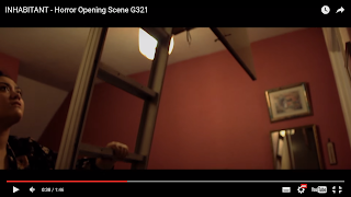
This is our 5th significant screen grab. Before this shot we had a blackout shot of our credits reading "in association with" then there is a quick jump cut that takes us back the scene and it is a shot of Ellie pulling down the metal stairs from the attic. We zoomed in the camera so that it is a close up shot of the metal stairs and we did a panning shot where the camera panned down the stairs as she pulled them down. The sharp sound of the metal stairs scraping was recorded and added on top of footage so that the sound was louder and in better quality. As this sound of the stairs scrapping added to the eerie mood. This shot is also effective as we see the characters face looking up into the attic with a curious expression indicating that this is the first time she is entering the attic making the audience wonder what the attic is like.
This is our sixth screen grab of our opening scene. It is Black out shot that cuts in between the scenes of Ellie going up the attic. It included the title of the institution we have a synergy with. We chose to have the credits shots in between scenes so that they are used to cross cut from one shot to the other. This helped increase the pace of the scene by jumping from the scene to shots of the credits it would leave the audience on the edge of their seat. We used block white font for our clockwork productions so that they stand out on the black background.
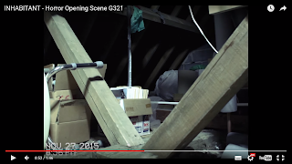
This is our seventh screen grab of our INHABITANT opening. It is a medium establishing shot of the attic the story is based around.In this shot we added a downloaded font with the time and date at the bottom corner so this suggests that filming is being done by hand by the main character at this point suggesting this is a home-made footage. This was effective as we were able to control the time and date and we chose a time in the evening so that it connotes danger as scary things usually happen at night time making this character more vulnerable. In this shot we can see a dim lit attic that is full of clutter such as old cardboard boxes and wood.the far end of the attic how ever is dark and this makes the audience curious as we cant clearly see what is in all of the attic.
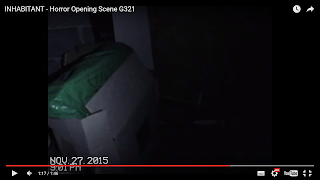
This is our eighth screen grab from INHABITANT opening. It is a shot that is taken right after there is a black out in the attic as the lights have mysterious turned off. Our main character then used the torch on her phone as a source f light so that the camera can reveal what's in front of her. We decided to have a shot of the camera focused on a white box in front of the character while everything else in the attics surroundings is in darkness. This is an effective shot as it creates suspense as the light is only shinning on irrelevant objects making the audience fear what else is in the darkness. As the the character in this scene is made to feel vulnerable as she can only see a limited amount of what she shines her torch on. We also increased the time at the bottom corner of the shot to inform the audience that time is passing and that it is getting later into the night which connotes danger we did the by using VCR digital font that conformed to a typical handmade footage.
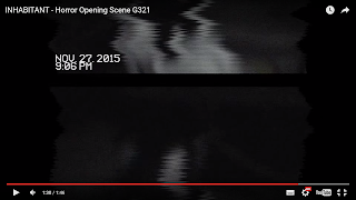
This is our ninth screen grab from INHABITANT. It is a medium shot that is filmed in the dark attic we used the torch on the characters phone as a source of light as she slowly panned to right with her torch, it created a tense atmosphere and then when the camera revealed a figure in white in the right hand side, we edited this shot so that it would have a glitching effect that causes distortion and indicates that there is bad connection. This editing was very effective in this shot as it makes the audience feel scared as they didn't clearly see what that figure was and it makes them wonder "what was that?" The distortion used in this shot also emphasises the realism of the hand made footage and suggests that the camera could stop filming at any moment leaving the audience tense to find out what happens to this character.
Subscribe to:
Comments (Atom)

